



RETORIO
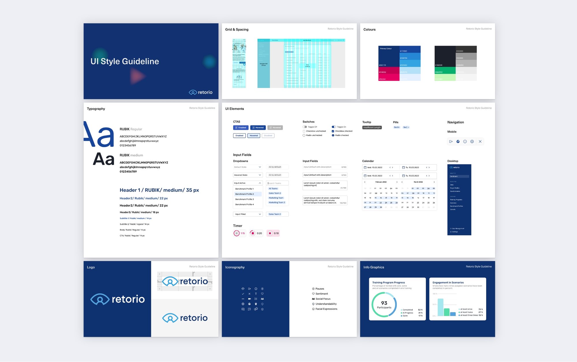
I structured behavioral and training data into a clear information architecture, built a UI style guide for colors, typography and components, and refined flows and micro-interactions, from the recorder to the analytics. The result is an interface that supports fast, confident decisions.
FAQ
By showing progress rather than verdicts.
Scores are set against trends and recommendations, strengths precede weaknesses, and every data visualisation answers a question a coach would actually ask. The data stays precise, the tone stays human.
At Studio Hint I designed the dashboard and redefined the visual identity.
I structured behavioural and training data into a clear information architecture and refined flows and micro-interactions, from the recorder, where candidates practise and review their answers, to the analytics, where trainers compare cohorts and skills.
Because the product kept growing.
I defined colour, typography, grid, iconography, infographics and every UI state from default to hover, so that the team could build new features that still read as one product.